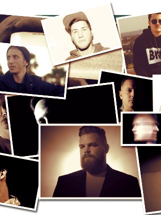
Jimmy Edgar Gives a Nod to His Most Coveted Album Covers
Call me out if I’m misreading the sitch, but I feel like the appreciation of album art has fallen by the wayside over the years. That’s not to say kickass covers are no longer being produced (believe me, there are plenty to go around). But with the advent of music streaming services, along with the convenience of buying tunes digitally with a quick click of your mouse, kids just aren’t ingesting music like they used to. In turn, the album cover is not getting the love it deserves. Not cool.
I’m definitely not preaching to Jimmy Edgar here. The dude has a well-trained eye that could put me to shame any day (in fact, he’s already done so below). In my defense, though, the techno genius and co-head of the Ultramajic imprint—among the many other artistic hats he wears—is also a super talented graphic designer who handles the artwork for most of his releases. It’s no surprise, then, that I wanted to hit him up about his five fave album covers. Run through the list to find out which ones made the cut.
Howard Johnson The Vision

His song “So Fine” is one of my all-time favorites. This cover design exudes class and fun—it doesn’t seem to be trying to be anything else. The typeface is typical ‘90s fun style: extended fonts, and misaligned to create excitement and a sort of zigzag motion. I love how the statue in the background looks as if it’s trying to see through the curtains; this is the kind of background action that makes for an amazing photo. Howard is, of course, having the time of his life while they are shooting him. This was hip-hop back then—trying to create an aura of success through a seemingly luxurious environment, dope clothing and art appreciation.
Sylvester Do You Wanna Funk

Pilar Zeta and I were searching for airbrush artworks while we were designing some Ultramajic stuff last year, and we came across this and were completely blown away. It wasn’t until recently that we found out it was a Sylvester cover. I really like this airbrush style of using gradients to paint. I’m always searching for some kind of minimalistic perfection to create form and beauty, and this cover is a great example of that. I really love how they did the hair—very shiny.
Depeche Mode Violator

This cover is classic. I think it’s probably one of the first designs that I was really able to appreciate. I was really drawn to the red. It’s a whole package that really works. I normally don’t prefer Helvetica, but this was done so classy, and the gray is an amazing touch. The way gray was used in the ‘80s is so interesting to me, because it was a color of technology and a color of computers/computer advertising design. The Violator script is also a great contrast between their logo and the vibe of the rose, which looks like a screen print. The symbol of the rose, for me, represents innocence; and the fact that it’s posterized and the stem is incomplete and seems to be broken… says “Violator” loud and clear.
The Distractions Time Goes by so Slow

Peter Saville is one of the best designers to ever live. If you don’t know him, then look up everything he has done. This is one of his less obvious covers, but I love this chalk-drawn outline vibe that was so popular in the ‘80s and ‘90s—it’s along the lines of lipstick on a mirror, or a casual note written from your secret lover. The composition and use of space with the typography is perfect; it makes you want to read it. At first they appear as meaningless symbols, and then it makes sense after initial study. The color of the black really works for me because of the low contrast and grainy quality, but this could be an effect from a vintage record, which is part of the whole appeal.
Black Sabbath Technical Ecstasy

Strom Thurgerson is another designer that has had the most impact on our designs. He did the famous Pink Floyd cover, which I almost put in this list because I love talking about the symbolism of it, but it was perhaps too obvious. This one is a strange one from Strom, but it reminds me of the time when all metal bands were starting to discover synthesizers and technology (see Neil Young “Trans”). The typeface is really dope; I would use something like that today. I don’t quite get the cover, but I like the textures. It’s like an egg shooting oil onto an art deco building/man/robot, and they are both on opposing escalators. Are they sharing a laser moment in some kind of McDonald’s stairway in some Las Vegas hotel? I’m not sure, but whatever it is, it’s “Technical Ecstasy.”
Follow Jimmy Edgar on Facebook | Twitter | SoundCloud
Share
Tags
You might also like