100 Best Electronic Music Album Covers

What makes an album cover great—or important? Obviously, a pleasing visual aesthetic is paramount, but of course, that’s subjective. Is the image unique? Does it undeniably grab one’s attention? Does it shock and stir, or does it simply please the eye? Does it succeed as a complete graphic, as opposed to simply slapping some text over an image? Was it groundbreaking or relevant at the time, and has it wedged itself into our cultural memory to this day?
This isn’t about the music or the act behind it—at least, that’s what we kept having to tell ourselves during this selection process. It’s strictly about the image. Even in a time when album art has been reduced from the expansive real estate of a vinyl sleeve to the 150-pixel icon on your Spotify stream, that cover still serves as a signifier—from an enticing vehicle for music discovery to the familiar ID in your saved favorites. It’s still a vital part of the package.
With that in mind, and after much deliberation, we give you our 100 favorites.
100. Tortoise – It’s All Around You (2004)
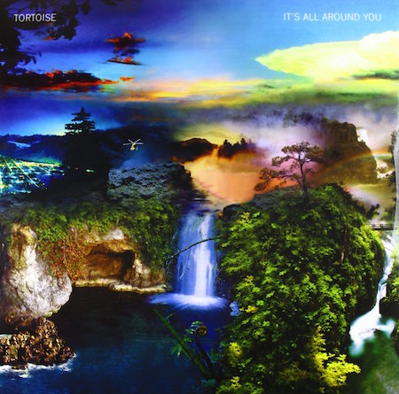
I don’t think this is anyone’s favorite album by the synth-tinged post-rock outfit Tortoise—many critics found it to be a mere shadow of their former works—but the cover for It’s All Around You is the one to rule them all. A slightly cropped version of a 1997 work by New York-based artist Oliver Wasow, this surreal depiction of Washington’s Mount Rainier composites facets of the natural landscape in an almost cubist manner, like a best-of brochure for the great outdoors that looms over the city. Indeed, for those willing to look beyond our urban silos, the magic and beauty of the natural world is all around you. Interestingly, Mount Rainier’s volcanic activity and glacial ice threaten the entire valley at its feet, rendering its beauty ironically deceptive. Sadly, it’s an apt metaphor for the cover it graces. Take my advice: Enjoy this image, but then go listen to Standards. —Monica Howe
99. Kavinsky – OutRun (2013)
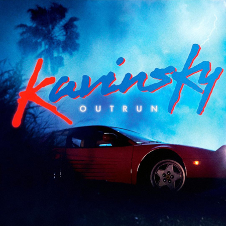
What’s important to know in regards to the cover art for French electro-house producer Kavinsky’s 2013 OutRun is that the album is a concept work following the story of a guy who crashes his Ferrari Testarossa in 1986 and reappears in 2006 as a lovesick zombie who produces dark, throttling electronic music (listen to the track “Prelude” for more info). With that narrative in mind, the ‘80s horror-film-inspired cover—featuring a bolt of lightning, a palm tree, a single figure shrouded in darkness, and the headlights of the aforementioned car cutting through the gloom—makes perfect retro sense. —Katie Bain
98. Sébastien Tellier – Sexuality (2008)

The French do not subscribe to American puritanism. Therefore, when multi-instrumentalist and electronica seducer Sébastien Tellier made this 11-track, baby-making soundtrack, he had no qualms taking John Mayer’s metaphorical concept of your body as wonderland into reality. The cover shows a lone man—Tellier, is that you?—on his trusty steed, setting out to explore every pleasurable inch of a woman’s curves. The music inside will touch you in different sexy places in quite the same manner. —Kat Bein
97. Gorillaz – Plastic Beach (2010)

How do you follow up iconic album art like Demon Days? You could make another great album cover, or you could make another four like the Gorillaz did. The iTunes edition of Plastic Beach features four different covers, all showing the featured island in the day, evening, twilight and night. As with everything Gorillaz, there is more than meets the eye, and the album has a complementary Journey to Plastic Beach video, which explains the creation of the plastic paradise. —Chase Welcher
96. Carl Craig – More Songs About Food and Revolutionary Art (1997)
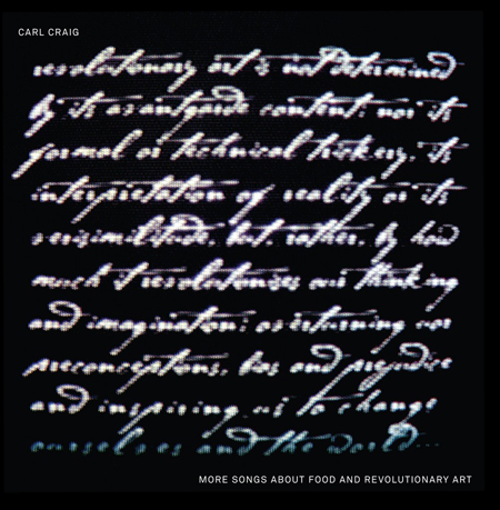
Inventive, and exquisitely electronic, Craig goes his own way here and creates one of the most interesting electronic albums ever (I guess you can call it a techno classic, although I hate that term). The cover art has a statement from Jeff Sawell written in statesman-like script: “Revolutionary art is not determined by its avant-garde content, nor its formal or technical trickery, its interpretation of reality or its verisimilitude, but rather, by how much it revolutionises our thinking and imagination, overturning our preconceptions, bias and prejudice and inspiring us to change ourselves and the world…” Declaration, indeed. —Dennis Kane
95. Mr. Fingers – Amnesia (1988)
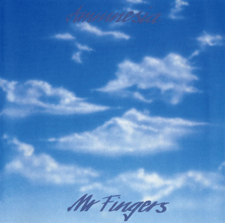
A classic album with numerous great tracks, like “Can You Feel It,” “Washing Machine,” “Mystery of Love” and “Stars”—it’s all so good. The cover has a rendered cloudscape with a minimal graphic; it captures the lightness of Mr. Fingers’ production style and the reverie-like vibe of the songs. —Dennis Kane
94. Chris and Cosey – Heartbeat (1981)
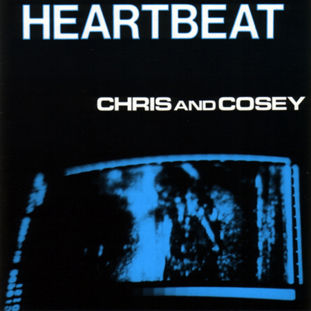
Former Throbbing Gristle members Chris Carter and Cosi Fanni Tutti signed with Rough Trade and began a long collaborative project that is still bearing fruit. A punk sensibility, analog electronics, and arch melancholy saturate their work. Their first LP bears a decidedly Lynchian, Beth B-like cover, like some vague, dark memory. —Dennis Kane
93. Jimmy Edgar – Majenta (2012)
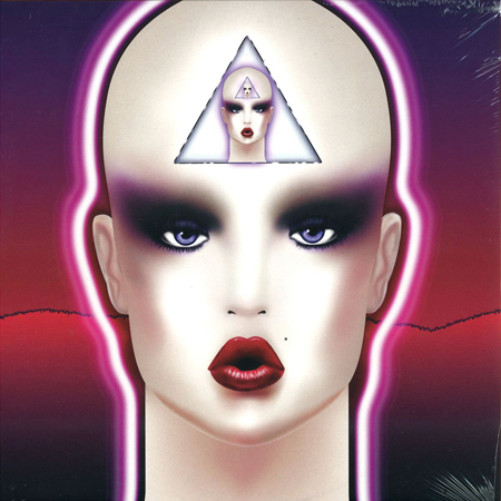
The Ultramajic team is at the top of the game when it comes to aesthetic creativity in the electronic music scene. Not only is their design work in a league of its own, but their music catalog is fresh, different, and perfect for any techno or house head looking for something new. Label boss Jimmy Edgar’s Majenta has cover art that stands out for the imprint. A bald yet alluring, glowing feminine figure is illuminated in the forefront, with a majestic blend of purple and red in the background. On her forehead, her own image is repeated, creating a distinct and memorable illustration. —Joe Wiseman
92. The Cinematic Orchestra – Motion (1999)
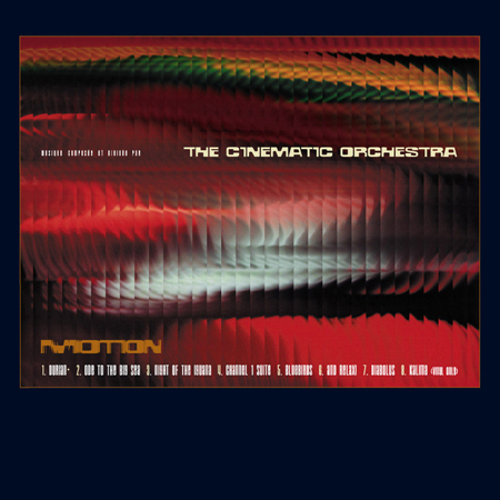
Lush and haunting, tracks are assembled by sample, then played live, and finally brought back into software for final grooming. The cover is a series of sequenced film stills cut and assembled, a static sequencing of time. —Dennis Kane
91. Porter Robinson – Worlds (2014)

Worlds marked a large turning point for Porter Robinson. It signaled a change from his bass-heavy music of the past (like his EP Spitfire) to his more alternative form of electronic music. Worlds also signaled a change from live DJ sets to ones focusing on real-time sampling and live instruments for Robinson’s tour in support of Worlds. The cover art was done by David Aguado, who also did the cover for the “Sad Machine” single. Worlds features the signature 【=◈︿◈=】 symbol used by Porter Robinson, with a floating hand (similar to the one in the “Sad Machine” video) holding a cube, displayed against a backdrop of thin, colorful clouds. —Chase Welcher
90. The Chemical Brothers – Exit Planet Dust (1995)

The prototype for most of what is called EDM is sketched out on this first offering by this duo. Heavy beats, a mix of rock and trance and techno stabs, and you got it—drops!!! I’m not a huge fan of this record, but it has had impact. I love the cover shot, apparently taken from a rejected ‘70s fashion shoot, the beautiful NorCal hippie image a nice contrast to the overwrought sounds. —Dennis Kane
89. Moodymann – Moodymann (2014)
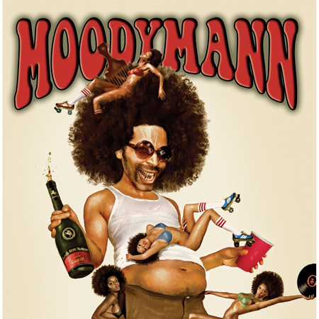
Moodymann’s double-fisting with bikini-clad baes all around. Gut out, pick up, in one image he’s both the everyday commoner and someone you could never hope to be. This is what Moodymann wants you to know about him. The Detroit house and techno producer lends his vocals throughout his self-titled album, asking such questions as “You like yo’ friend chicken without hot sauce?” All I can say is, I’ll have whatever you’re having, Kenny. —Anum Khan
88. Squarepusher – Damogen Furies (2015)
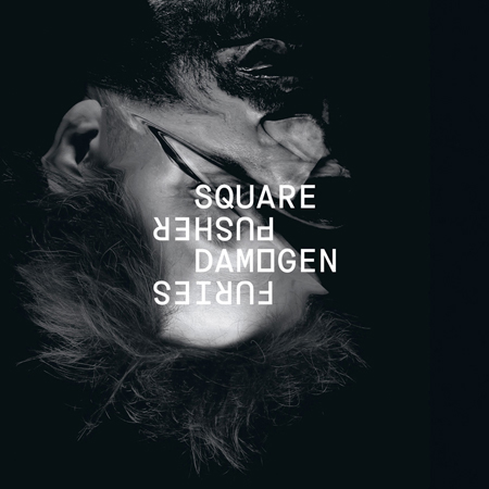
The arresting cover and additional imagery for this LP was shot by one of our favorites, and someone I have had the good fortune to work with over the years, Tim Saccenti (he shot the cover of my last 12″). Here, his morphed and sliced cover image, which has a kind of meta nightmare feel, complements the way Tom Jenkinson forms and shreds ideas in his compositions. There is a riot going on in this work, and the cover reflects it aptly. —Dennis Kane
87. Metro Area – Metro Area (2002)
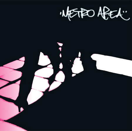
In this classic album—the forerunner to most nu-disco made in the last 10–12 years—a boogie vibe is given clean and sparse but lush production. On the cover, we see a beautiful, cropped found image of an illuminated dancefloor, with the “Metro Area” tag (Darshan’s handwriting) its only graphic. Proper, inside and out. —Dennis Kane
86. 808 State – 90 (1990)
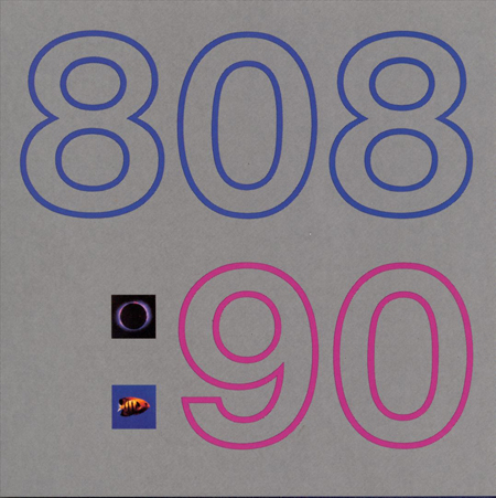
Acid house gold here, Martin Price, Gerald Simpson and Graham Massey created an anthem with “Pacific State” that ranks among the era’s biggest jams. The cover is a bold, simple graphic with “808:90” front and center, the colon cubes featuring a salt-water fish and lunar eclipse respectively. Rave on. —Dennis Kane
85. Hercules & Love Affair – Hercules & Love Affair (2008)
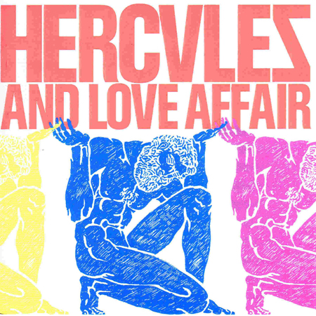
On one level, the name Hercules & Love Affair could allude to the drama rife in ancient mythology, an era run amok with gods, monsters, mortals, death, tragedy and war. From album opener “Time Will” to the infectious “Blind,” melodrama is found throughout the perfectly crafted debut from producer Andy Butler and his merry cast of flamboyant vocalists and weirdos. Upon immediate glance, the album’s cover tells its story in full: a trio of hand-drawn Atlas sculptures in flashy neon colors carrying the weight and turmoil of the world on their individual shoulders. Its design reflects the music within: colorful and loud, but serious when it needs to be. The cover is classic and modern all at once, exactly like the heavily disco-inspired cuts and vintage house across the album. Like Butler himself and mirrored via the artwork, Hercules & Love Affair represents the best of the past filtered through the new hope of the future. —John Ochoa
84. Groove Armada – Lovebox (2002)

While Lovebox did little to move out from under the shadows of Groove Armada’s previous albums, the imagery slapped across the exterior of its sleeve is arguably the most eye-catching from their body of work. The title, also that of the London duo’s game-changing club nights and festival fun, is hard to miss, as it is displayed in a crossword-borrowing concept illuminated in all its neon-sign glory. The blue, pink and yellow hues from the letters are now eternally burned on the inside of my eyelids, and I can’t close my eyes whenever listening to the LP without visualizing this lambent illustration of a light fixture that could easily fit well in almost any nightclub you would have stepped in during the early noughties. If that doesn’t say a job well done to you, then you, my friend, are a tough crowd. —Sam Yu
83. Azari & III – Azari & III (2011)

Much like Disney’s The Little Mermaid penis faux pas, the sexual undertones of Azari & III are hidden in absolute, all-too-obvious plain sight. The cover—a pointed skyscraper gently and loosely clasped by the giant yet gentle hand of a presumed woman—is phallic hypersexuality presented in gorgeous art form. Its teasing foreplay, moments before fellatio, is a sexy balance between lovemaking and loin savagery. Raw. Naked. Sensual. Erotic. Beautiful. All the makings of sex in its purest form. Once the needle hits the record, there’s no telling where night will go. To this day, I get aroused just looking at it. —John Ochoa
82. Mylo – Destroy Rock & Roll (2004)

In retrospect, statements like Destroy Rock & Roll on electronica-era album covers feel like that stupid brand of audacity that’s easy to lampoon in films like All Gone Pete Tong. The album cover is pretty great, though. A less-informed person in the modern age would assume it to be Banksy. Maybe that’s a statement on Banksy; maybe it’s a statement on pop. Maybe it’s a statement on how cheesy some underground things look through a mainstream filter. All I know is that “Drop the Pressure” feels like Galantis’ “Peanut Butter Jelly,” so musically, the album still holds up to this day. —Marcus Dowling
81. Ratatat – Classics (2006)

Classics is a classic. The sophomore LP of the Brooklyn electronic-rock duo is legendary, and the art might even stand out in some people’s heads more than the music itself. Filled completely with the image of a growling feline, the artwork highlights one of the biggest tracks off the LP, which for obvious reasons was titled “Wildcat.” The record was a hit, and the art has stuck in my head ever since hearing the track for the first time. Raawrrr. —Joe Wiseman
80. Fatboy Slim – You’ve Come a Long Way, Baby (1998)
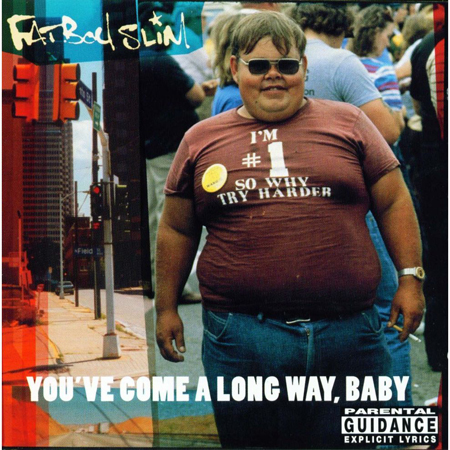
From the album’s title (taken from the marketing slogan for Virginia Slims cigarettes) to its cover, featuring a s self-satisfied-looking, overweight man sporting a T-shirt that says “I’M #1 SO WHY TRY HARDER,” everything about Fatboy Slim’s 1998 album You’ve Come a Long Way, Baby, smacked of wicked humor and a certain sort of modern malaise. It was a visual message in line with the sonic ethos of the commercial smash, which was packed with big-beat feel-goodness, including hits like “The Rockafeller Skank” and “Gangster Trippin.” An alternative album cover featuring Norman Cook’s own massive vinyl collection was released in North America because we, presumably, are prudes. —Katie Bain
79. Mantronix – The Album (1985)
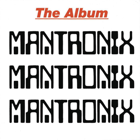
The word “Mantronix” is repeated three times in a ‘70s future font (Computer), like some data spit out by the 808. Proto acid house ghetto futurism. Bang. —Dennis Kane
78. Todd Terje – It’s Album Time (2014)

This cover art was designed by Bendik Kaltenborn, best known for his illustrations in The New Yorker magazine. I love the aesthetic that Kaltenborn goes for in this work; all of his illustrations have a colorful, vintage look to them. His portraits are uniquely characteristic, and the typefaces he uses are fun and change often, even within the same sentence. He said Terje wanted “something that played with the idea of a cheesy ‘70s album cover” for It’s Album Time, he delivered wonderfully on that request. The cover features a suave rendition of Terje in a blue leisure suit, sitting at his piano with a handful of tropical drinks. The album art seems like something straight out of your parents’ record collection. All it needs is that familiar, musty old-record smell. —Chase Welcher
77. Nine Inch Nails – The Downward Spiral (1994)
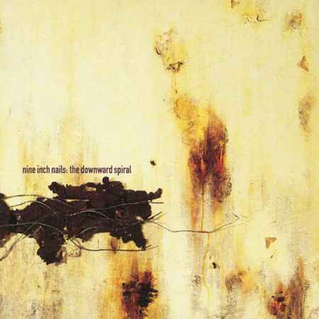
Russell Mills’ Wound, the mixed-media piece that became the cover art for this album, was inspired by the juxtaposition of pain and healing, two themes that form the crux of The Downward Spiral. As with most of Reznor’s releases for this album, what you saw on the cover was only a portion of the full work. Mills embedded everyting from dead insects and blood to feathers and teeth on his canvas, a twisted creative menagerie that was echoed again in the video for “Closer,” which featured twisted and disparate images inspired by Joel-Peter Witkin. Acidic, warm, uncomfortable, beautiful, terrifying—NIN in a nutshell. —Rich Thomas
76. Brian Eno – Music for Airports (1978)
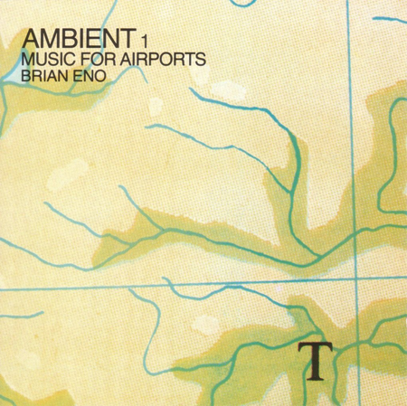
Constructed by Eno with a little help from Robert Wyatt, four tracks are meant to be played in a continuous loop. Developed after Eno noticed how awful the ambient sound of airports are, the idea was that the work would inspire a calm and thoughtful atmosphere. The cover shows a cropped section of a flight map and was designed by Eno as well. —Dennis Kane
75. Sun Electric – Present (1996)

Dub-influenced techno, heavy synth strings and ambient cycles are all aspects of this slept-on LP. Tom Thiel and Max Loderbauer (Moritz von Oswald trio) created a unified work that has hints of jungle, as well as serial music. The cover art is constructed of ribbons of the same image bitmapped with various digital texture. Almost like a Madonna painting, but with the head horizontal not vertical, the art is fragmented and melancholy, like the music. —Dennis Kane
74. The Orb – Adventures Beyond the Ultraworld (1991)
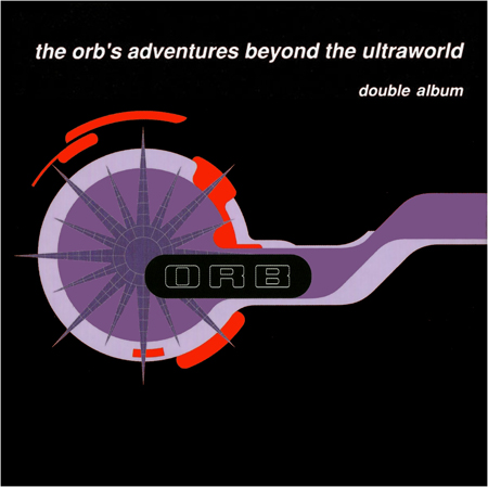
This double LP is psychedelic and progressive, with a heavy dub influence throughout. The cover shows a stylized turbine, designed by the Designers Republic. The US version features an image of the Battersea Power Station. I go with the OG; it is a simple, emblematic cover. —Dennis Kane
73. Junior Boys – It’s All True (2011)
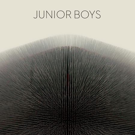
A double-exposed image, which from a certain distance seems provocative, is actually a photo of the British Pavilion in Shanghai, designed by Heatherwick Studio (google it—it’s a remarkable building). Writing of the LP started in Shanghai, and in many ways it is the most mature work from this duo, with strong melodies and more of a lush ‘80s sound saturating it. —Dennis Kane
72. Padded Cell – Night Must Fall (2008)
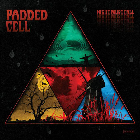
With a cover that calls to mind a Stephen King paperback, Padded Cell bring the darkness; they also bring a B-boy sensibility to the proceedings. This is darkness that will make you move your feet and shake that ass. I remember going to visit Richard Sen when they were finishing this LP. Their studio was in a subway station and down the street from a mental hospital, an appropriate locale for this recording. —Dennis Kane
71. Manuel Göttsching – E2–E4 (1984)
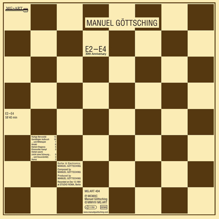
An essential piece of minimal progressive electronica, this has some great guitar work throughout. It’s named after a common opening chess move—and the tuning of his guitar. The minimal chessboard cover is iconic, and the music sounds like it was made yesterday. —Dennis Kane
70. Autechre – Draft 7.30 (2003)

Autechre’s glitchy and buzzing IDM sound was something I thought was only for nerds when I was turned onto this album. I was an Ibiza house guy then, crazier about Modjo’s “Lady” than being keen on raving too deeply. However, when I began to understand the whole art-as-music dynamic that governed part of the Manchester scene, Autechre’s Draft 7.30 definitely made more sense to me. Creating a sound and experiencing it through all senses is important. Using a piece of architecture to represent the feel and style of loops and chords is audacious, and if you nail it, it ends up on lists like these. —Marcus Dowling
69. The Bloody Beetroots – Romborama (2009)
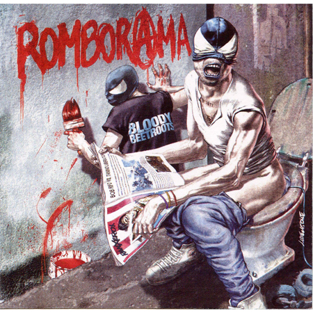
The Bloody Beetroots stood out from the pack right from the get-go via a unique sound that meshed gripping rock guitars and heavy electro. Like creator Sir Bob Cornelius Rifo, the Bloody Beetroots project was punk rock to the rotten core—so much so that Rifo boasts a tattoo of the year 1977—when punk rock was born—on his chest as an ink billboard advertising his full-fledged dedication to the movement. Italian comics illustrator Tanino Liberatore nailed the anarchist spirit of Rifo and Romborama on the album artwork. It spits in your face with no regard to human decency or social restraint. Somehow, you’re left wiping your grin and begging for more. —John Ochoa
68. Glasser – Ring (2010)

This gorgeous fractal couldn’t more perfectly herald the kaleidoscope of layered vocals, swirling synths and percussive textures found within the debut LP by Glasser, aka Cameron Mesirow. Along with the art for her Apply EP, it was created by Tauba Auerbach, who told Redefine she made the painting “by shattering a piece of glass on a panel, and then using the shards as a stencil, lifting up one at a time and spraying paint in the hole left by the missing piece.” The same year as Ring’s release, Auerbach and Mesirow partnered as Auerglass (get it?), under which they designed a two-person pump organ that “cannot be played alone. Each player has a keyboard with alternating notes of a four-octave scale. Each player must pump to supply the wind to the other player’s notes.” It’s a lyrical metaphor for any symbiotic relationship—whether that of close friends or collaborative partners, or in this pair’s case, both. —Monica Howe
67. Happy Mondays – Bummed (1988)
The blushing beauty on the cover looks like she’s up to something. Open it up, and you’ll in fact see she’s a naked lady. You see, Bummed, in this sense, doesn’t mean your Monday is any less happy; it just means you’re having “the sex.” On their second album, the Manchester band embraced more electronic elements, helping marry their post-punk, rock-centric scene with the acid house movement happening throughout the rest of the UK. We all know dance music is pretty sexy. It makes sense. —Kat Bein
66. M.I.A. – Kala (2007)
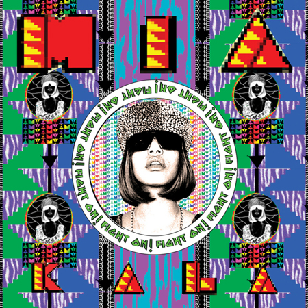
Kala helped launch M.I.A. to the masses with the smash hit “Paper Planes,” featuring the beats of EDM poster boy Diplo. The artwork encompasses all the out-of-the-box sonic arrangements possible in one LP within a single image. Colorful and commanding, the cover profiles M.I.A. as a majestic overlord with the words “FIGHT ON!” repeating around the center profile image to push a strong message forward. A treat for the eyes, the artwork is as memorable as the album itself. —Joe Wiseman
65. Isolée – We Are Monster (2005)
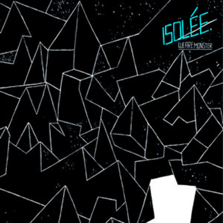
Rajko Müller brings it both funky and minimal on his second LP. Critics go nuts for this record; I’m not there with them—other things he has done register more for me—but I love the cover drawing. It’s perhaps a fractal or astronomical chart, also suggesting volume. Hand-drawn, there’s a nice childlike charm to the quality of line. —Dennis Kane
64. Ryuichi Sakamoto – B-2 Unit (1980)
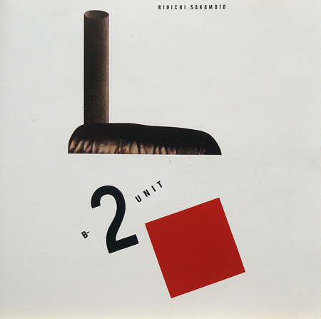
A great solo LP by the Yellow Magic Orchestra principal, this was a hugely influential work—see Mantronix or Afrika Bambaataa. “Riot in Lagos” is the jam, and the cover is a great tribute to Russian suprematist artist and theoretician Kazimir Malevich. —Dennis Kane
63. Panda Bear – Meets the Grim Reaper (2015)
Designed by Swiss artist Marco Papiro, this is one of my favorite covers of 2015. The artistic combination of typography, shape and color is like nothing you see today as album art. PBVSGR saw a number of other creative ideas to promote the well-reviewed album, including a Boiler Room performance at MoMA, a music video premiere on Adult Swim, and a crazy interactive website that also contains work from Papiro. —Chase Welcher
62. DJ Sprinkles – Midtown 120 Blues (2008)
Terre Thaemlitz’s engagement with gender politics has always been fearless and, as incongruous as it may sound, fun. His work always reminds me of the better, sleazier parts that made New York great (sadly, they are pretty much all gone). This cover art recalls the neo-expressionism that permeated the East Village in the late ‘80s. —Dennis Kane
61. Claude VonStroke – Urban Animal (2013)
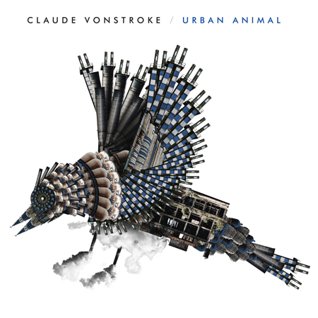
I highly suggest looking up a large-scale version of this image so you can fully appreciate all of its intricacies. Traditionally a symbol of freedom, the bird showcased on the Urban Animals cover is made of dilapidated buildings, smoke stacks and other less-than-flattering signs of city life. Claude’s third studio album—and 100th dirtybird release—came with a cover that’s nothing less than a stroke of genius, as it reminds us we are all urban animals seeking refuge in whatever deep, dark (club) space we can find. —Anum Khan
60. Armand Van Helden – Killing Puritans (2000)

“This year, Van Helden is Armand and Dangerous,” the promo for Killing Puritans declared. If you’re like me, you had to read that twice. Don’t let the terrible pun deter you from taking a listen to this album, however, which showcases Van Helden’s adeptness at mixing jazz, drum & bass, house, rap, breakbeat, electronica and more. If you bought a physical copy of it, you’ll remember that symbols replaced letters throughout, meaning people had to decipher a code to even figure out the track list (sounds familiar). That’s not the only thing hidden about this album: The startling cover was so controversial that UK versions were sold in cardboard sleeves that covered the image. —Anum Khan
59. Dan Deacon – Spiderman of the Rings (2007)

Oh, Dan Deacon, you lovable weirdo. You wizard of controlled chaos. Thank you for your noise, your sublime pairings of disquieting pixel blips and childlike irreverence, and for ridiculous titles like 2007’s Spiderman of the Rings and its appropriately bizarre cover. Designed by Ben Furgal—a Philadelphia-based artist, gallery curator and musician in his own right—collaged elements bring us a rocket-launcher-laden girl too taken with a bone she’s found to worry about the ticking clock at her back. What does it mean, and what does it have to do with Marvel or Tolkien? Maybe it’s an open love letter to the general nerdiness shared by Deacon, a geek on so many levels, and Furgal, a self-professed Hobbit-lover and creator of a 2014 art show about UFOs. And maybe it’s not meant for us to comprehend on a cerebral level at all. Hey, that’s fine. Sometimes weird is just weird. —Monica Howe
58. MSTRKRFT – The Looks (2006)
According to Jesse F. Keeler, the mustached half of MSTRKRFT, the title for The Looks—the electro duo’s debut album—was inspired by an American Idol episode in which judge Randy Jackson critiqued a female contestant on having “the looks” to make it big but lacking the actual talent. Keeler and his partner Al-P found it comical, as the concept of “the looks” means nothing, especially in terms of dance music. “This music isn’t about what we look like or a deep statement on how the music industry looks or anything,” he told The Stranger. “It’s about what we can make the dancefloor look like, which is full.”
It’s ironic, though, how much the looks of The Looks played into the initial MSTRKRFT aesthetic. I look at the cover now and still, to this day, have trouble distinguishing it from the used electronica bins and an of Montreal album cover reject. It makes sense, as MSTRKRFT bridged the early electro days with the dance punk revivalism of the aughts. The cover art, created by design/art duo Seripop, won the Juno Award for Best CD/DVD Cover Design of the Year in 2007. The blurry mess of half robot noise and half punk spritz resonates on the swirly face of The Looks. It’s a fingerprint documenting an era via future art. —John Ochoa
57. Tangerine Dream – Rubycon (1975)
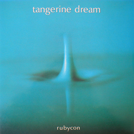
One of this great band’s best albums, this prime example of the Berlin School sound bears a stunningly simple cover image of a single drop of water impacting a still liquid plane, the action frozen in blue abstracted detail. —Dennis Kane
56. Boards of Canada – Geogaddi (2002)

This sun-saturated, red-orange, kaleidoscopic image depicts a child standing, arms spread, between two trees. The cover represents the tone of the work accurately; there is a sense of dread and an ominous tenor in the compositions. —Dennis Kane
55. DyE – Cocktail Citron (2014)
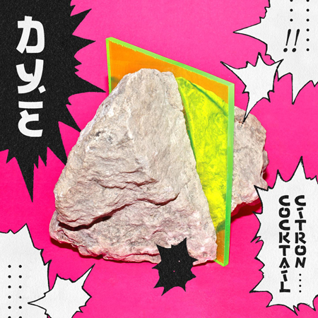
You can always count on producer Juan de Guillebon for something eye-popping and unique. You might remember the mesmerizing video for “She’s Bad,” as featured in our top music videos of 2014, and here’s the album art to go with it. Gracing DyE’s sophomore LP is this Dragon Ball-inspired design by Parisian graphic design studio Tu Sais Qui, featuring photography by UK artist Jack Fisher. A mashup of ‘80s pop colors, manga influence and that mysterious plex-meets-rock centerpiece, it’s a perfect visual for this quirkily danceable journey through the throwback sounds of disco, electro and the French avant-garde. —Monica Howe
54. Arca – Xen (2014)
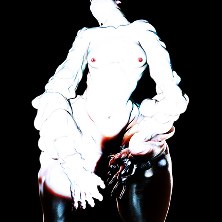
Xen features an ambient and experimental techno funk sound that’s symbolized on the cover through a hyper-idealized and pulchritudinous woman. Similar to how A Tribe Called Quest’s sensual woman in Afrocentric body paint represented the full-bodied and soulful grooves and vibe of the group, Arca’s sensuous woman, who appears to also be a melting candle, gives a seductive, deviant and wild sense to what lies behind the cover. Given this album was his first, Arca’s woman could be stylized in so many ways it could represent a theme he can return to often throughout his career to come. —Marcus Dowling
53. Tosca – Opera (1998)
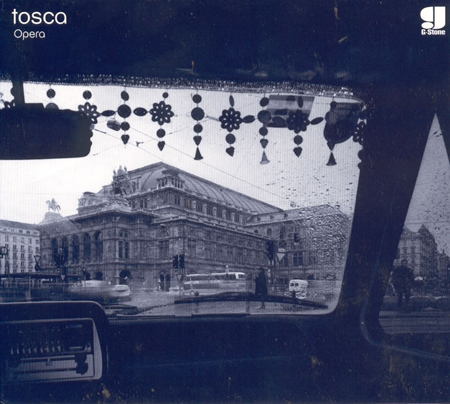
Put Opera on repeat. Then put it on repeat again. Its downtempo trip-hop take on electronic is best understood with a few big spoonfuls, ideally when the atmosphere is thick and heavy. The album’s light use of lyrics and heavy use of sampling lets what’s truly important—the music—breathe. The cover photograph showcases the opera house in Tosca’s native Vienna. The rain, the old-school car, the black-and-whiteness—it’s exactly the type of environment I’d want to listen to Opera in, preferably on repeat. —Anum Khan
52. A Guy Called Gerald – Hot Lemonade (1989)
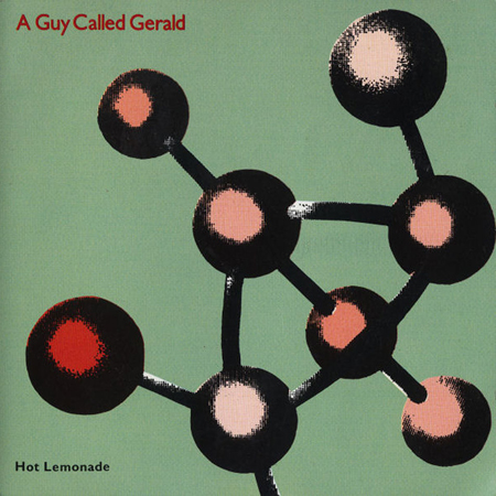
Here’s some acid freshness recorded after the success of Voodoo Ray. On a pale, hospital-green cover, some molecular form or sculpture hovers, abstract and intriguing. The first LP by this hugely influential producer, the early vibes of what would be jungle and drum & bass are here, and the acid house he brings is rinsed in Chicago and Detroit vibes. —Dennis Kane
51. Hot Chip – Why Make Sense (2015)

I have already written about this cover, but it merits a repeat mention. Using a hand-screened process, no two copies of this work will be the same. That uniqueness of tone and hue brings a kind of intimacy to the act of buying a record. It is one of the elements that make buying an LP so special. It functions as an object; it is art on its own, and combined with the music, it creates a great experience for each of us. —Dennis Kane
50. The Avalanches – Since I Left You (2000)
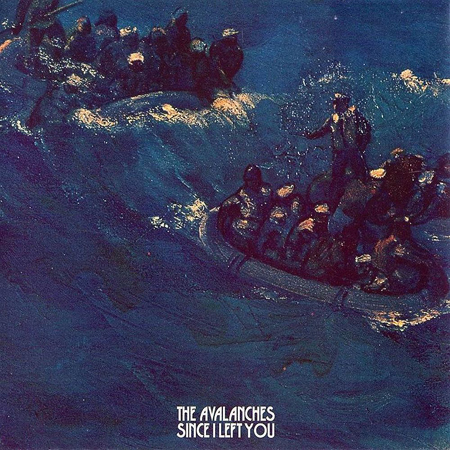
A recurring nightmare I had as a child was that of being at sea in a life raft at night, at the whim of the ocean’s pulse. Well, here is a painting of such a scenario, suggesting in this instance a sunken Titanic, or WWII battleship survivors—an affecting cover for a sample-heavy (more than 3,500 samples) and reverie-inducing soundscape. It’s a favorite record of mine to clean the house to. —Dennis Kane
49. The KLF – Chill Out (1990)

Sheep are lounging in this bucolic cover, which in the original versions, had no type or signage of any kind. It is an arresting pastoral image for a contemporary electronic music cover. The music is a continuous composition, a soundtrack for an imaginary journey from the Texas Gulf to Louisiana—ambient to the fullest. —Dennis Kane
48. Underworld – A Hundred Days Off (2002)
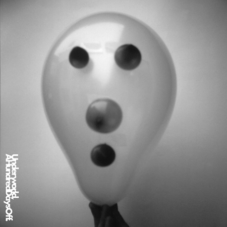
A bizarre balloon head, shot in black and white, suggests a ghost or an alien, or one of David Lynch’s melting snowmen. A nice, driving LP of techno-friendly dance sounds, it’s held together by an underlying dreamlike narrative. I still have a soft spot for “Luetin.” —Dennis Kane
47. Four Tet – There Is Love in You (2010)
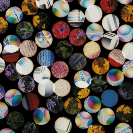
Upon first glance, it’s difficult to tell what the cover of Four Tet’s gorgeous 2010 album There Is Love in You is actually composed of. From a distance, it looks like dozens of tiny, multicolored circles. Up close, one can see that each of these circles contains bits of computer-rendered graphic design, as well as images of flowers. Perhaps that’s the key here. While clearly digitally composed, the cover contains trace elements of the organic, which speaks to an album on which hundreds of robot-like electronic beats compose music that is most definitely alive. —Katie Bain
46. KMFDM – Angst (1993)

When I was a moody pre-teen listening to Blink-182, my mom decided it was time to introduce me to real punk rock. After an intro to the Clash and the Sex Pistols, I fell down a rabbit hole of infinite angry possibility. I eventually found goth music and, finally, industrial. KMFDM’s industrial metal is special, just as danceable as it is headbanging. On Angst, the band captures every feeling a disillusioned teenager could have and presents it with lyrical style. On intro song “Sucks,” the singer asks, “Are you ready for this?” and then interjects that “We don’t care.” The cover perfectly captures this kind of reality. It’s like, yeah, you’re angsty, but you know you love it. —Kat Bein
45. Massive Attack – 100th Window (2003)

Never a huge Massive Attack fan, I snagged this LP for the cover art alone. Some sort of plaster or resin mannequin is shattered and captured in a photograph mid-explosion, with the title and band name simply rendered in the tapeworm font (shouts to Ed Ruscha). A compelling cover, it always reminds me of 9/11—entirely a subjective response, but it registers each time I look at the image. —Dennis Kane
44. DJ Koze – Amygdala (2013)

I first discovered DJ Koze back in my college radio days. When digging through new CDs to play at KCPR, this album cover seemed to jump out from the rest. It features German producer DJ Koze riding atop a reindeer, sitting in a psychedelic and colorful forest environment. Needless to say, I played the album on air and fell in love with its unique sound. Amygdala features collaborations with Caribou and Matthew Dear, and the track “Ich Schreib’ Dir ein Buch 2013” contains a motown choir covering “Ain’t No Mountain High Enough,” which is twisted and warped into the deep and eclectic soundscape that is DJ Koze. —Chase Welcher
43. UNKLE – Never, Never, Land (2003)
UNKLE’s second album, Never, Never, Land, should be amazing. DJ Shadow was on the first UNKLE record and is gone by the second. I’ll never forget when taking in the art for this one in the record store—when doing that was a thing—I noted the smooth ohm on the cover of their debut Psyence Fiction appeared to have been ripped apart, which made the direction of the record immediately apparent. This is far more free jazz and much less a boom-bap of a record, with a cover that feels—like the music—similar, yet wholly different from before. —Marcus Dowling
42. Girl Talk – Feed the Animals (2008)

By the late aughts, Gregg Gillis, the former biomedical engineer known to most as mashup genius Girl Talk, had perfected his method: take seconds-long snippets of some of the best and most recognizable songs in popular music, and layer them on top of each other in the most surprising and joy-inspiring combinations imaginable. It was a winning equation that came fully formulated on Girl Talk’s 2008 Feed the Animals, and the cover art—the “GT” initials ablaze in the pristinely manicured front lawn of a cookie-cutter suburban abode—perfectly illustrated Gillis’ art form of raiding the safe and standard hits of Top 40 radio and turning them on their asses into something a bit more fire. —Katie Bain
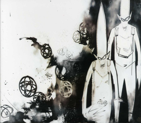
41. SBTRKT – SBTRKT (2011)

SBTRKT’s Aaron Jerome would likely not take kindly to Disclosure’s Settle coming in ahead of his self-titled debut LP on this list, what with the noted observations that the Lawrence brothers’ artistic direction has resembled his own on more than one occasion (it’s been said that this funky spider is biting his style as well). Accusations aside, SBTRKT’s signature identity is unmistakably his own. Worn live and in his marketing, his masks are “inspired by many native and ancient societies from a global viewpoint,” according to A Hidden Place, the masks’ designer, who—like Jerome—chooses to create under a veil of anonymity.
“Initially, the idea behind the mask was to give freedom to the music,” says Jerome. “[I’d] rather not talk about myself as a person, and let the music speak for itself. The name SBTRKT is me taking myself away from that whole process.” It’s fitting for a producer known for remixing and collaborating with a variety of other artists. With the familiar voices of Sampha, Jessie Ware and others at the forefront on the album—as well as on last year’s follow-up, Wonder Where We Land (a close contender for this list, btw)—the listener’s usual frontman-focused linchpin is gone, leaving us to consider the musical undercurrent beneath the facade. —Monica Howe
40. Brian Briggs – Brian Damage (1980)
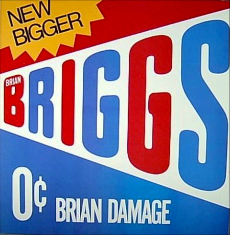
A great pop art cover, Brian is presented like a product. It reminds me of the Bazooka bubble gum packaging: Newer, Bigger, but 0¢! It’s a terrific album as well, by noted engineer John Holbrook (he worked with Hendrix, the Who and the Isley Brothers, among others). “Aeo” is still a classic minimal jam. —Dennis Kane
39. Crystal Castles – Crystal Castles (2008)

It was a familiar sight in 2008 to see friends imitating this image, slumping against a wall so only the top of each person’s head was visible. Crystal Castles’ infamous cover to their debut album started a trend and a garnered a new generation of listeners to electronic music. The cover reminds me of my freshman year of college, when I first started DJing and was rockin’ acid-washed super skinny jeans with a leather jacket, blasting “Air War” out of my headphones. The nostalgia is real. —Joe Wiseman
38. Jon Hopkins – Immunity (2013)

Drop a book on the ground, or even tap a table lightly with your hand. The resulting energy ripples, like in a body of water, are exactly what I think of when I think of Immunity. Individual tracks rely heavily on sluggish bass sequences that are just as experimental as they are fleeting. The album’s jagged, crystalline cover art is, surprisingly, not computer-generated at all, instead created by a chemical reaction photographed by biochemist Linden Gledhill under an extremely high-power microscope. The red and purple forms you see in the artwork are actually clusters of food dye molecules crystallizing over a period of time, viewed through a spectral lens to bring out the colors. For Hopkins, such chemical reactions serve to visualize different components of his music and different sounds in his head, a process he often describes as best represented in color changes. Sound cool? The Creators Project highlighted the phenomenon in this video, which I definitely recommend giving a watch. —David Matthews
37. Felix da Housecat – Devin Dazzle & the Neon Fever (2004)
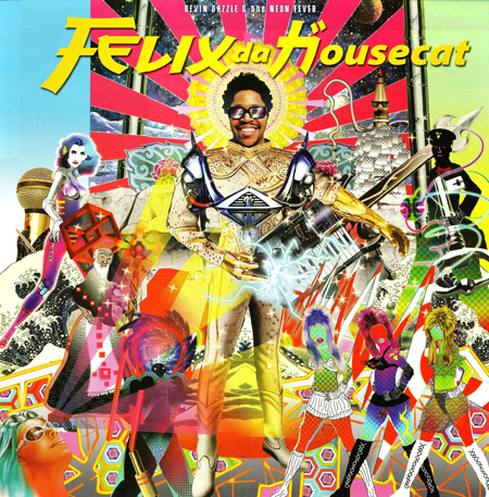
Devin Dazzle and his gang of Neon Fever gals chronicle their clubbing (mis)adventures on this concept album, the fifth for Felix da Housecat. He trades in his electro and house know-how for a heavily synth-pop project, producing a body of work that could have come straight from 1984. Then there’s the absolutely fabulous album cover, centering around Devin Dazzle’s Elvis-meets-Tron ensemble that’s literally electrifying. Fun fact: the artwork was designed by Kenneth Tin-Kin Hung, who’s featured in the EDC Las Vegas 2015 print magazine (just flip to page 35). All I can say is, I wish my fantasies looked this fantastic. —Anum Khan
36. Die Antwoord – Ten$ion (2012)

Hey, it’s Die Antwoord’s Yo-Landi Vi$$er in giant angel wings—with her trademark insect eyes and alien hair—munching stoically on a bloody heart. No bigs. Those familiar with the “Freeky” antics of South Africa’s favorite (only?) zef-rap act most likely didn’t bat an eye when their sophomore LP Ten$ion dropped in 2012, bearing this striking image as its badge. As one reviewer pointed out, it was less than a year after Daenerys Targaryen devoured a horse’s heart on Game of Thrones; cardiovascular consumption was all the rage. And honestly, if Die Antwoord wrapped up a live set with Yo-Landi riding off on a dragon, would you even be surprised? —Monica Howe
35. Kraftwerk – Trans Europe Express (1977)
This was a huge record from these titans of electronica. What makes the original cover of this so great is the bleed, the tonality, and the photographer’s signature. The band is presented like some ersatz lounge act, really one of the first postmodern ironic graphic gestures seen. The painters, Gerhard Richter and Sigmar Polke, had done similar portraits as a show invite, but this was a major artistic gesture and commentary on the idea of an artist portrait. Sadly, a lot of it is lost in the formatting of the American cover. The colors are changed, and the framing is clumsily altered. The original comes with a great poster, as well. —Dennis Kane
34. Yellow Magic Orchestra – X∞Multiplies (1980)
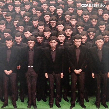
This is not my favorite LP by this band—in fact, probably my least favorite. It’s an odd mini-LP of new wave/pop with sketches, an attempt at a sort of meta-commentary on the nature of pop music. This is strictly a cover choice. The sculpted multiples of the band members, front and back, is haunting and was very timely when the simulacrum was becoming a much-discussed topic. —Dennis Kane
33. Air – Moon Safari (1998)
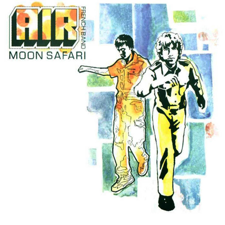
If there’s one go-to album for the bedroom on this list, it would have to be Air’s Moon Safari. This album feels as good as it sounds, comparable to warm towels out of the drier or a soft, white robe after a long bath. It’s kind of surprising that this lovely and very feminine journey was created by the two Frenchmen on the cover, but every lighthearted guitar pluck and neatly placed horn fits perfectly into place and creates a wondrous escape to ecstasy. —Troy Kurtz
32. Klaxons – Surfing the Void (2010)
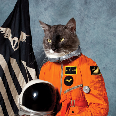
If you think nothing good comes out of drinking, just take a look at this Klaxons cover. After returning home following a booze-filled night out, the band’s members ended up searching through (what else?) pictures of cats in spacesuits. After realizing how funny a billboard of the image would look, the group decided to make it a reality. Polydor got a real US space suit (to which they added the flags and badges you see on the cover), and Jamie Reynold’s cat was offered up to model. The end result is one of the top 100 electronic album covers of all time. —Anum Khan
31. Pretty Lights – Glowing in the Darkest Night (2010)
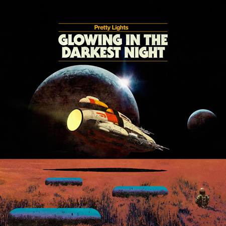
Taking a deep dive into the Pretty Lights catalog is akin to taking a trip to deep space, which makes the interstellar expedition-themed cover of 2010’s Glowing in the Darkest Night both visually appealing and wholly appropriate. The clean design and rich color tones give the image the look and feel of a 1960s movie poster (the 2001: A Space Odyssey vibes are strong), while the solo figure standing in the red field in the bottom-left corner adds a sort of ominous feel to the image. You can’t, after all, have light(s) without some darkness. —Katie Bain
30. Battles – Mirrored (2007)
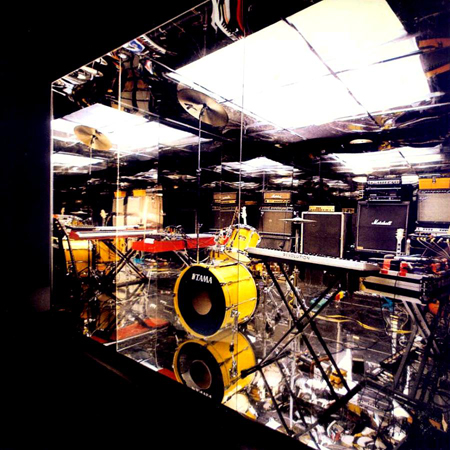
There’s no way to take in all this album cover offers with just one look. As soon as I saw it was in the running for our list, I knew it had to make the cut. While Mirrored may lack the bleeps and bloops of your usual electronic album, it showcases Battles’ acute adeptness at using technology to modify and reshape what a rock band could sound like. This pristine photography comes from the mind of Tim Saccenti, also the director of the “Atlas” music video (and the designer of the #88 album cover on this list). —Anum Khan
29. DJ Shadow – Endtroducing….. (1996)
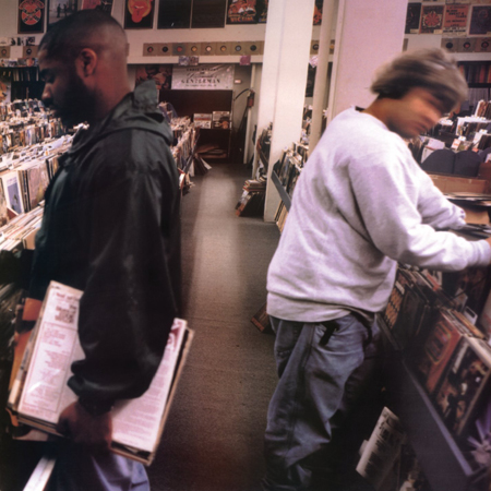
The cover for DJ Shadow’s debut full-length hit the nail on the head for crate-diggers far and wide, who’d spent the better bulk of their life sifting through vinyl selections at in-the-cut spots for those rare records filling up the spaces in their carefully curated crates. Endtroducing….. is a staple for sample-based music, as it was created almost entirely in the span of two years from spliced-together snippets straight from wax that only someone of Shadow’s caliber is capable of digging up. Therefore, the image provided by photog B+ did more than just completely encapsulate the ethos behind Shadow’s soul and significance as an artist; it offered a snapshot worth 1,000 words, signifying an entire cultural movement. —Sam Yu
28. Burial – Untrue (2007)

Burial’s dark and twisted conglomeration of dubstep, garage, hardcore and house rocked the music world in the mid 2000s, but nobody knew who the man was behind the music. After releasing two widely acclaimed records that earned him a Mercury Prize nomination, the rumor mill was alive with wild speculations that Burial was a new side project of artists like Fatboy Slim, Four Tet or Aphex Twin. But in 2008, Will Bevan took to his Myspace blog and announced to the world that he’s just a low-key person who wanted to make some tunes. His humble declaration shocked the music blogs and set the internet ablaze. Finally, listeners could place the face on Untrue as that of a man uninterested with the fame and aplomb currently driving today’s dance music stars. —Troy Kurtz
27. Major Lazer – Guns Don’t Kill People… Lazers Do (2009)

2009’s Guns Don’t Kill People… Lazers Do was a portal into the wild and wacky world of Major Lazer, a group that in sound and spirit very much embodied EDM’s cultural takeover of that era. Illustrated by London-based artist Ferry Gouw—the man responsible for creating the entire Major Lazer visual concept, including last year’s animated television series—the cover art served as a CliffsNotes primer for a cartoonishly violent, goofy and sexed-up visual aesthetic that perfectly matched the album’s aggressive and larger-than-life, dancehall-infused sound. —Katie Bain
26. Plastikman – Sheet One (1993)
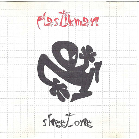
The illicit references are hard to ignore here—an obvious nod to the psychotropic poison of choice of the hordes of techno heads who would frequent the unregulated, anything-goes raves of yesteryear. Designed to mimic a sheet of LSD, legend has it that the cover once led to a man being taken into custody, after a police officer saw the album sitting in plain sight on the dashboard of his car. That acid-tinged aesthetic is echoed in the minimalist approach employed by Richie Hawtin throughout the debut album of his Plastikman alias. It was a stroke of genius, to the say the least. —Sam Yu
25. Fischerspooner – #1 (2000)
Receiving a polarized response upon its release in 2001, #1 was hailed by some as a pioneering release, more art-directed than written. Others, like Pitchfork, referred to Casey Spooner and Warren Fischer as “liberal-arts dilettantes” and “snotty white Americans” “exploring their self-obsessed, nerdy sexuality.” Say what you will about the tunes, but the cover epitomized the smarmy, hyper-stylized world of electroclash, which helped the electronic music movement back onto its feet after it got drunk on big beat and face-planted outside of the bar. —Rich Thomas
24. Caribou – Our Love (2014)
I clearly remember watching Caribou perform “Can’t Do Without You” at this year’s Coachella. It was a little over a week after a tumultuous breakup, and I had started falling for another girl from my past. As I lay flat on the grassy floor at the Mojave tent after a day’s worth of dry heat and intense sun, my mind and my feet finally at ease for a brief moment, I envisioned the cover of Our Love. I imagined the kaleidoscopic spectrum to be the visual equivalent of falling in love. It’s warm, it’s bright, it’s unpredictable. It looks right. It feels right. It’s love. —John Ochoa
23. Lemon Jelly – Lost Horizons (2002)

Lemon Jelly’s trip-hop classic Lost Horizons had album art that didn’t truly speak to me until, say, 2005—when Showtime debuted Weeds. According to Malvina Reynolds’ theme song “Little Boxes,” the suburbs are “all built out of ticky-tacky, and they all look just the same.” Though no homes are in the idyllic suburban plot on Lost Horizon’s cover, trip-hop has always been one of those sounds that, for me, is like the show Weeds—all in discovering the dirt in the layers, as the samples provide the haunting echoes lying beneath the picturesque surfaces. —Marcus Dowling
22. Walter Carlos – Clockwork Orange (1972)
A chilling Moog soundtrack for Kubrick’s masterpiece, this blew my mind as a kid. I knew the LP before I saw the film, and I was still trying to wrap my head around Walter becoming Wendy. I like the Columbia cover with the Joseph Cornell-inspired collage. —Dennis Kane
21. Tycho – Dive (2011)

What makes Dive so special (and Awake too, for the same reason) is the fact that Scott Hansen was able to use his years’ worth of design and media skills to create the full work in its entirety, from album artwork to posters to live video projections to merchandise. It doesn’t matter if Dive borrows heavy inspiration from older ambient acts Boards of Canada or Ulrich Schnauss; the LP is untouchable, and purely Tycho. It’s an absolute triumph of ambient electronic music, an amalgamation of audio elements ranging from electronic components to analog instruments that make listening to Dive such an intensely immersive, multifaceted, 50-minute experience. —David Matthews
20. Radiohead – Kid A (2000)
Cold, angular, alienating—the artwork for Radiohead’s groundbreaking fourth studio album was a joint design effort between Thom Yorke and Dan Rickwood (aka Stanley Donwood), who has worked with Radiohead on their cover art since the release of the My Iron Lung EP in 1994. As with all the best album art, what you saw on the cover panel was just the tip of the iceberg, pun intended. Yorke and Rickwood apparently became infatuated with the website for the Worldwatch Institute, a research organization that provided no shortage of mind-numbing, fear-inducing statistics on the planet’s slow demise. At least that’s what was probably going through Yorke’s head at the time. —Rich Thomas
19. Funki Porcini – Fast Asleep (2002)

A cheeky note in the credits for this album reads: The Uterus Goldmine modelled and designed by Openmind (132 layers and counting). Openmind is, of course, Ninja Tune’s own Kevin Foakes, aka DJ Food, aka Strictly Kev, who has been a cornerstone of the groundbreaking British label from both a music and design perspective. This cover depicts the title treatment spelled out using vintage synths—the ultimate eye candy for gear-spotters—and a girl fast asleep on a circuit board rug. The music, like the album cover, is a lush and inviting yet complex pastiche of downtempo bliss, a departure from the head-nodding trip-hop stylings of Funki’s previous LP. —Rich Thomas
18. ADULT. – The Way Things Fall (2013)

This is the duo’s fifth artist album, and the cover really nails the sound. Though released in 2013, there’s this nurturing, Devo-style thing happening that feels very new-wave-inspired. Who are these women? What exactly is their job? Is it perhaps the architecture of the universe they’re contemplating? And if that’s the case, it’s noteworthy they’re women. Is there some sort of Atlas Shrugged statement here about women being unable to balance the weight of the universe? This one proves that simple yet evocative is always the way to go. —Marcus Dowling
17. Cybotron – Enter (1983)
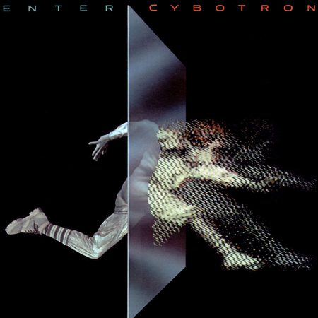
Juan Atkins’ and Richard Davis’ emblem of Detroit techno is a futuristic, obsessed work that still plays well, with drum machines and synths front-and-center. The cover sees a traditional athlete cross a plane into a digital rendering. Clear is still the go-to joint for a pop-locking session! —Dennis Kane
16. Boys Noize – Oi Oi Oi (2007)

The branding was so good on this album cover that Boys Noize still uses it as his Facebook profile picture, nearly 10 years after its release. Kudos to the designer, because the 13 tracks on Oi Oi Oi deserved a timeless piece of art. The album was a thrashing tour de force that fueled millions of fist-pumps across the world and inspired the wave of bloghaus to take over and spread like wildfire in America. —Troy Kurtz
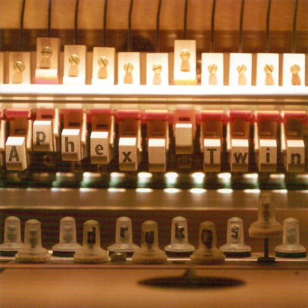
15. Aphex Twin – Drukqs (2001)
This wasn’t initially the most well-received LP from Richard James, aka Aphex Twin, but the 30 tracks on this effort improve with time. The cryptic title (usually translated as “drug use”) and equally mysterious cover—with his name marked on the keyboard hammers—provokes then haunts, like so much of his output. The harmonics on this LP are really beautiful and complex. From today’s perspective, Drukqs seems like a major work. —Dennis Kane
14. Daft Punk – Homework (1997)
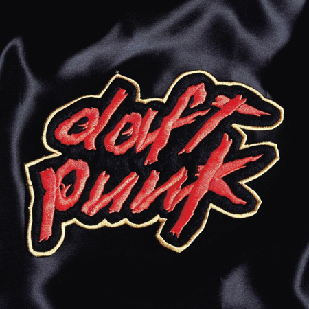
It’s practically impossible to separate my undying appreciation for the timeless tracks this album brought to the dance music table from the art that set its tone. We debated which cover should be deemed more iconic: this or Random Access Memories—an album backed by a marketing campaign that could rival the ad dollars spent by mass-consumed, corporately produced products, but which fell disastrously short in the ears of many disco-donning robot fanatics. In the end, Homework emerged victoriously.
Its sleek design could trigger a dance party merely from its recognized importance to an era of groundbreaking grooves. A sew-on Daft Punk patch—a nod to the punk rock practice of shouting allegiance to each fan’s favorite bands by stitching their names in a sprawling fashion on articles of clothing—is depicted on silky black fabric. To this very day, I still picture this image in my head whenever seminal jams like “Around the World” and “Da Funk” take total control of dancefloors. Well played, Daft Punk. —Sam Yu
13. New Order – Power, Corruption & Lies (1983)
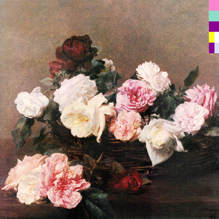
This is considered by many to be Peter Saville’s design masterpiece. I recently saw his notes and color studies for this, and it was illuminating to see how he deliberated on the smallest of choices; nothing is left to chance. It’s a great choice of a Fantil-Latour painting, and then some obsessive Pantone coding—a great LP and a monumental design project. —Dennis Kane
12. Björk – Homogenic (1997)

She’s an alien. She’s a geisha. She’s a sprite. She’s an alien geisha sprite. Or she’s just Björk being Björk on the cover of 1997’s Homogenic, a gorgeously sweeping, electronically rooted album that landed on many best-of-the-year lists and that Pitchfork called the 21st best album of the ‘90s. Björk has always been an evocative visual artist, and Homogenic’s cover, conceived by the late boundary-pushing fashion designer Alexander McQueen, found her bringing to life the album’s themes of love and loss. Of the image, Björk told the Chicago Sun Times that she was depicting a character who “had to become a warrior. A warrior who had to fight not with weapons, but with love. I had 10 kilos of hair on my head, and special contact lenses and a manicure that prevented me from eating with my fingers, and gaffer tape around my waist and high clogs so I couldn’t walk easily.” All worth it. —Katie Bain
11. Moby – Play (1999)
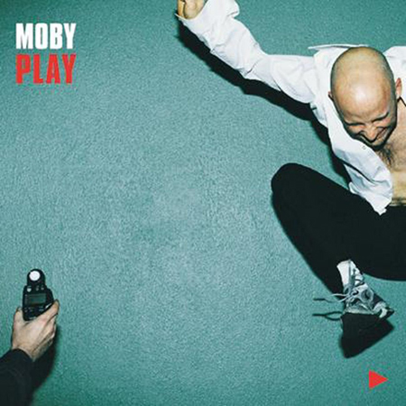
Like so many great albums, Moby’s enduring Play effectively captured the cultural zeitgeist of the era in which it was released, while also remaining timeless. It marked a watershed moment for electronic music’s crossover into the mainstream, becoming massively popular, introducing millions of people (including this then-teenaged Midwesterner) to computer music, and remaining Moby’s most commercially successful project to date.
The cover, a split-second image of Moby suspended in mid-air in front of a green wall, summarizes this moment-in-time idea, while also serving as a study in equilibrium. An anonymous hand clutches a light meter in the bottom-left corner, balancing Moby’s ecstatically jumping figure and the text and “play” symbol in the alternate corners and complementing the clean design. In sound and image, Play was altogether an instant classic that, to this day, remains instantly recognizable. —Katie Bain
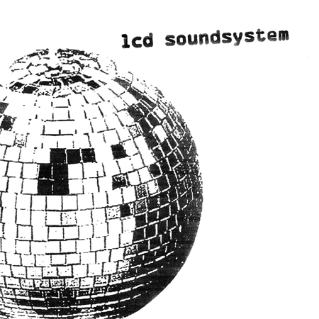
10. LCD Soundsystem – LCD Soundsystem (2005)
LCD Soundsystem exploded into popular culture with their 2005 self-titled artist album written entirely by their lead singer and DFA label cofounder James Murphy. Before Daft Punk was winning Grammys, Daft Punk was playing in his house. And before you even started collecting records, James Murphy showed you that his record collection is better than yours in “Losing my Edge.” Both this art and the band’s name are a nostalgic reference to the past days of music and the influences they have on modern dance culture. A black-and-white photo of a disco ball covers the album, showing us its missing pieces and seeming to lie on the floor, broken like the disco records of the infamous Disco Demolition Night of 1979. —Chase Welcher
9. Gary Numan – The Pleasure Principle (1979)
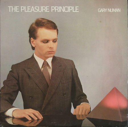
Full of nu-romantic futurism, this super art-directed cover screams ‘80s dystopian synth-pop. A very stunning girl gave me this record as an art student. She wasn’t a punk or B-girl; she wore makeup, stockings and thrift-store Dior finds. She looked like she belonged on a Roxy Music cover. I was floored. She took me to see Gary Numan in concert; he had an amazing stage set and a great sense of theater—way ahead of his time. —Dennis Kane
8. Grace Jones – Island Life (1985)
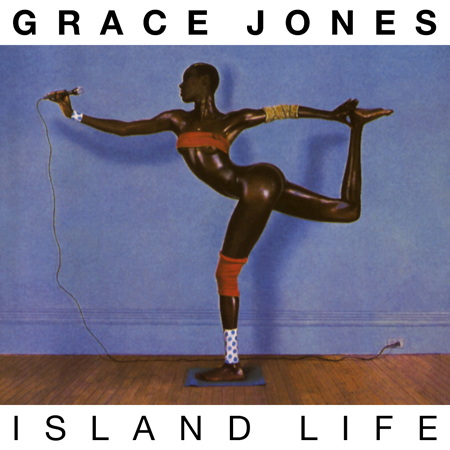
Try as I might, I don’t think any amount of downward dog or chaturanga could get me to achieve Grace Jones’ impeccable arabesque here. And that’s because it’s virtually impossible. The cover for this album was created by Jones’ then-partner Jean-Paul Goude, who combined separate images to create it (just consider him the original Photoshop wizard). Arranged chronologically, Island Life showcases Jones’ artistic development over the first nine years of her career. In 1996, the album was re-released with a bright yellow background, although everyone knows the classic azure is the bona fide choice of color for this masterpiece. —Anum Khan
7. The Prodigy – Music for the Jilted Generation (1994)
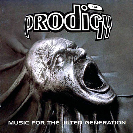
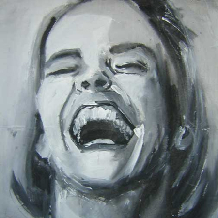
The Prodigy’s first album, Experience, had all the aesthetic flair of the Beatles’ White Album, but Music for the Jilted Generation more than made up for its predecessor’s lack of panache. Though Liam Howlett has maintained time and time again that the album was never political in nature, all three unique pieces of artwork—front cover, rear sleeve and inside sleeve, all designed by different artists—had an air of defiance about them (the inside gatefold is particularly relevant today). Stuart Haygarth’s screaming face was the perfect visual complement to songs like “Their Law,” “Break & Enter” and “Poison,” and it distanced the band even further from their brightly colored rave roots. —Rich Thomas
6. Disclosure – Settle (2013)
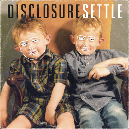
The image is deceptively simple: the rough outline of a gender-neutral face sketched over a mid-’90s baby picture of the brothers Disclosure, Guy and Howard Lawrence. Designed by a friend of the English producers, “the face” that appeared on the cover of the duo’s 2013 debut LP Settle made the boys at once look like dolls and robots, and has since become synonymous with the Disclosure juggernaut. Projected onstage during their lives sets, the image has also appeared on everything from baseball caps to stickers to the paper fans that were handed out to attendees of Coachella’s Gobi tent when Disclosure played the 2013 festival just before becoming insanely famous and critically adored. (It did indeed get sweaty inside that tent. I still have my fan in a shoebox somewhere.) There’s even the Disclosure Face app that will place “the face” over a photo of your own.
This widespread cultural impact stems from cover art that is at once fresh and vintage, much like the millennial house music that Settle is packed with. Treated to look like the worn sleeve of a vinyl album, the cover also nods to the crate-digging roots of the house scene, and thus the influences that birthed Disclosure into existence. Sometimes the simplest idea is the most impactful. —Katie Bain
5. Basement Jaxx – Remedy (1999)
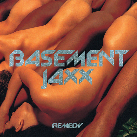
It’s only fitting for Basement Jaxx to kick down the doors of the music world with an album cover as loud as their debut release. When they dropped Remedy, the world stopped for just one second. It was the funky bass slaps of “Red Alert,” the bouncy goofiness of “Same Old Show,” and the vocoder drive of “Yo-Yo.” Remedy taught us that you don’t have to be serious to be taken seriously.
The cover speaks volumes. Naked men and women are stacked like sardines, bodies alternating between white and black men and women, equals in the same production line. It reflects the extended DNA of the duo, Felix Buxton and Simon Ratcliffe, who credit much of their successful sound to the soulful singers—often black females—featured throughout their discography.
“The idea was to make landscape-like hills and mountains, but only [using] living, human flesh, naked and together, showing no separation between black, white or any other color,” says Buxton. “I still remember the shoot day very clearly. I went in and moved [the bodies] all around, asking them to move closer. I was bright red with embarrassment, with bits and boobs popping out all over the place.”
It’s not sexual in any real sense, but instead a statement on the power of people and innate humanity, an essential factor within the Basement Jaxx universe. The Remedy cover pits human among, not against, human, and the songs within unite the world under one sound. —John Ochoa
4. Justice – Cross (2007)

You cannot think of Justice without thinking about the cross. Their 2007 LP Cross—or †—has become an iconic album, and the glowing cross has become a powerful symbol in their live performances. On Cross, Justice repurposes the ancient icon and gives it a 21st-century feeling by making it three-dimensional and giving it depth. Justice would keep playing with this symbolism for their 2011 album Audio, Video, Disco, where they displayed a large stone cross lying in a field. Many references have been made between rave culture and the church, and the power of Justice’s cross really does make me believe that God is a DJ. —Chase Welcher
3. Rustie – Green Language (2014)

After releasing his debut album Glass Swords, Rustie admitted he had some maturing to do. It was a brilliant mess of arena-size synths and Seinfeld-inspired bass riffs, but the Scottish producer knew he “went kind of quite crazy… taking the piss with kitsch sounds and over-the-top silliness.” Green Language is named after the “language of the birds,” which revolves around the idea of human communication with birds through song. Not only do the two flamingos look visually exquisite, but they represent a refined elegance in Rustie’s sparkling sound that manages to fuse his love of grime, trance and hip-hop. —Troy Kurtz
2. Massive Attack – Mezzanine (1998)

This squeamish-unfriendly, up-close-and-personal photograph of a South African beetle—snapped by Nick Knight, whose images of insects landed him lauded placements in the Museum of Natural History—makes me question my tolerance for insects as a whole. But I won’t let my personal unease take away from the cover’s spot-on summation of the album’s turbulent creation process. In the same way the creepy-crawly subject is magnified, to the point where it resembles an arachnid from Starship Troopers, it calls to mind the collective’s uphill struggle to reach a finished product. Despite Tricky walking away following a fallout with member 3D, the Bristol outfit still pulled off one of its strongest opuses to date. I don’t believe they could have found a more unsettling cover to represent both the album’s journey and the resulting collection of cerebral electronic rock punctuated by striking statements of jazz, reggae and funk. —Sam Yu
1. Kraftwerk – The Man-Machine (1978)
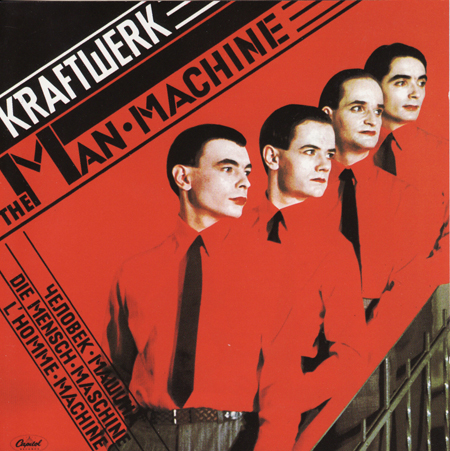
The best line I’ve ever read about Kraftwerk came from a 1975 interview in Creem magazine from legendary rock critic Lester Bangs, in which he quoted a friend describing the group’s Florian Schneider as looking “like he could build a computer or push a button and blow up half the world with the same amount of emotion.”
True story: I bought a vinyl copy of The Man-Machine without having heard one note of Kraftwerk. Sure, I knew their name and their legacy; but embarrassingly, I had never given them a listen. My purchase was based purely on visual aesthetic—and that title, so powerful and deep. Daft Punk introduced me to technological singularity via their Discovery and Human After All days, but The Man-Machine is the grandfather of human-technology symbiosis.
If sound and image were ever to reach perfect balance, The Man-Machine is the prototype marriage of the two elements. Yet I’m still mystified by this artwork. Should I be scared? Are these actually men or dapper, pale-skinned vampires? Their attire doesn’t feel like a carefully selected wardrobe for a photo shoot, but rather, a glimpse of uniformed soldiers in a post-nuclear dystopia. Looking eastward, their stoic faces say more than the music ever could: “We are your leaders. We may resemble the past, but we are setting a path for the future.” —John Ochoa